Roadtrippers Trip Planner Enhancements
Overview
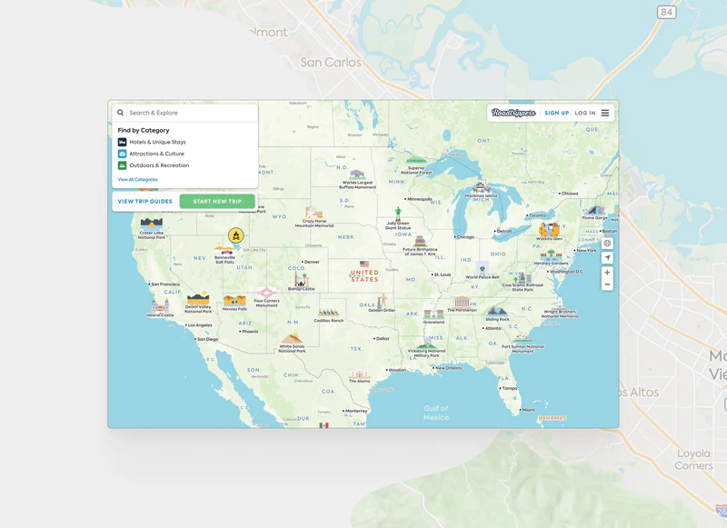
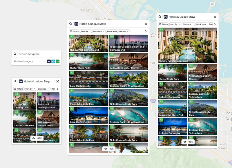
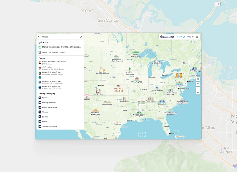
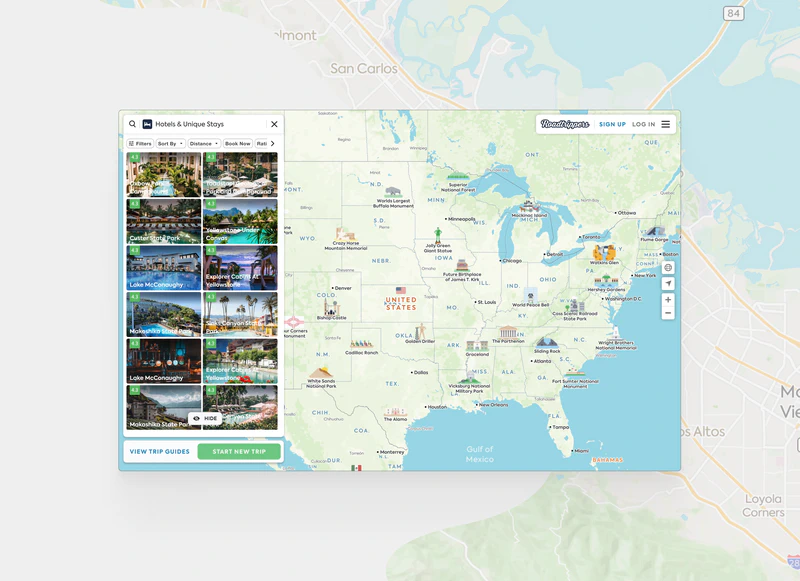
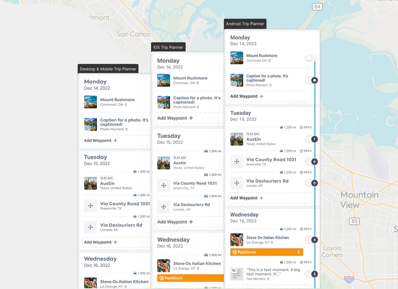
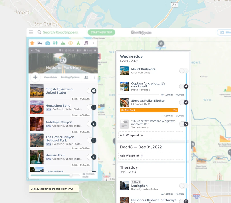
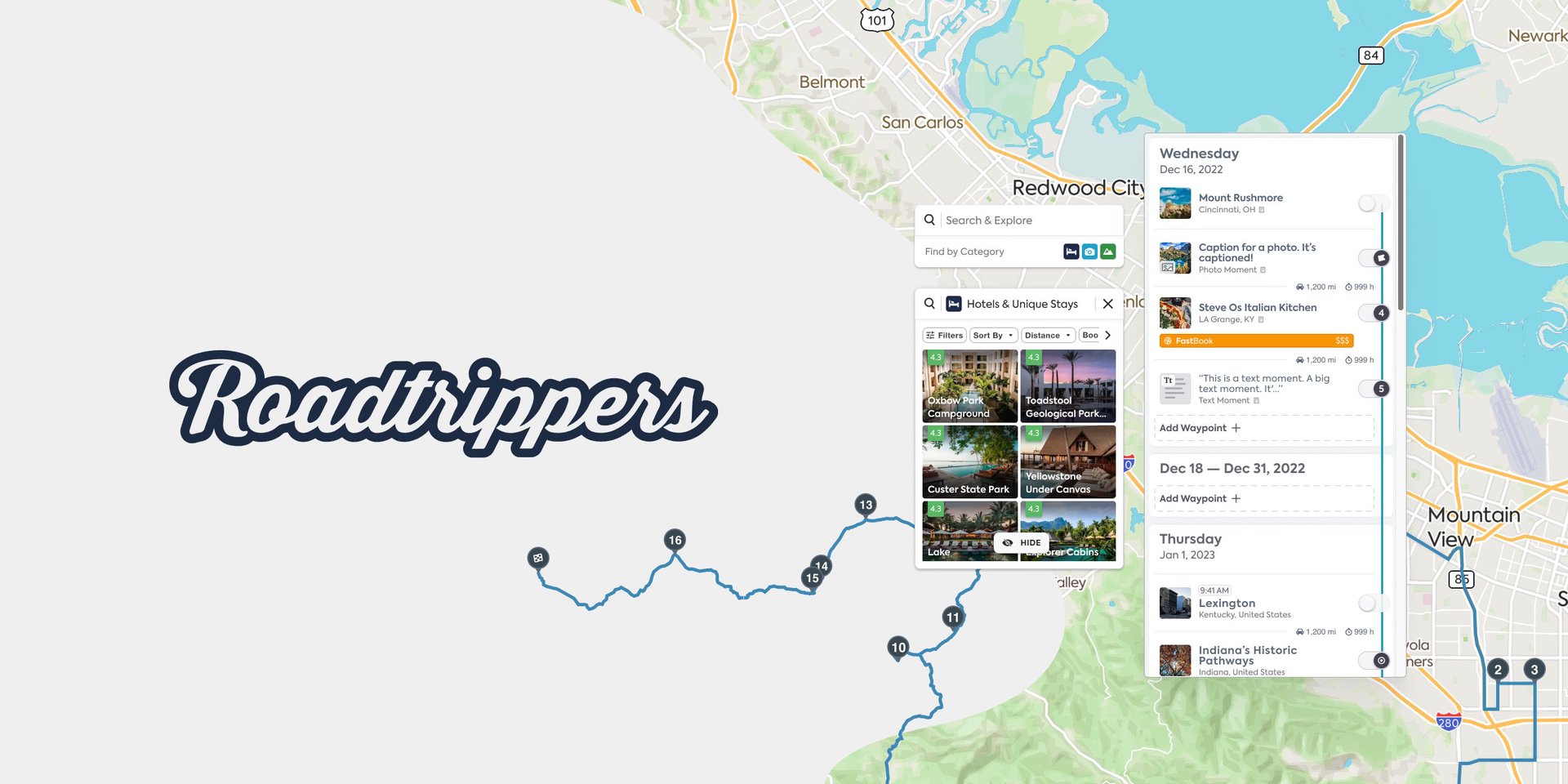
Project Teton was a comprehensive redesign of the Roadtrippers trip planner platform, focusing on enhancing the experience for power users—those who plan long, detailed road trips. As the lead designer, I collaborated with the Director of Product, two PMs, and another Sr. Designer to transform the platform’s core functionality and visual system. The project’s scope included creating a modular trip planner, improving search and filter capabilities, and developing a future-proof color system that would serve as the foundation for the Bonfire Design System.
Challenge
The existing Roadtrippers platform faced several critical issues that needed addressing:
- Power users lacked advanced functionality for planning detailed, multi-leg journeys
- Users couldn’t effectively segment itineraries by day, making long trip planning cumbersome
- Search and filter tools were inefficient, limiting detailed trip planning capabilities
- New user onboarding created friction due to a difficult-to-navigate interface
- The color scheme was inconsistent and didn’t meet accessibility standards
- The platform needed to maintain consistency across iOS, Android, and Web platforms
- The route line needed to remain on the right-hand side as part of brand identity
- Updates needed to be shipped in phases while maintaining functionality
Planning
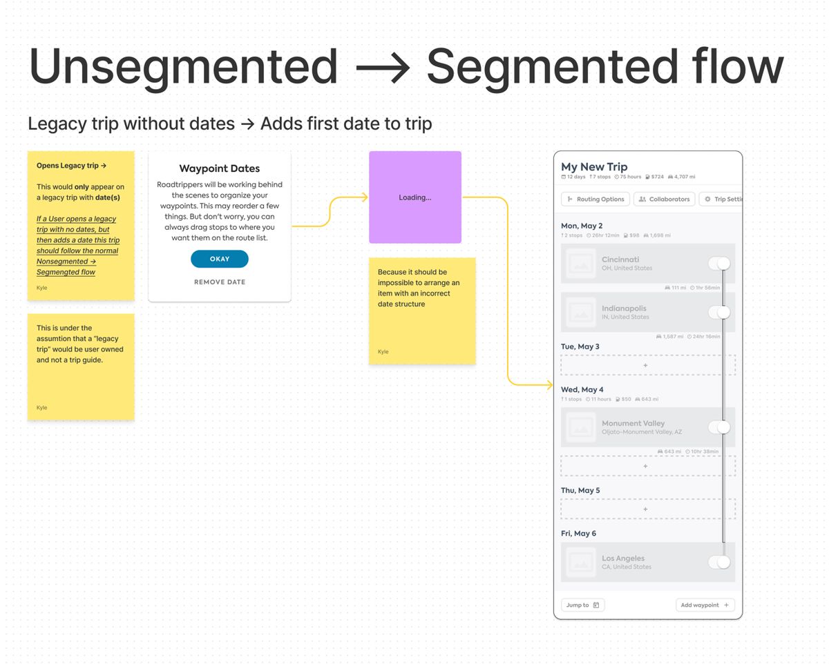
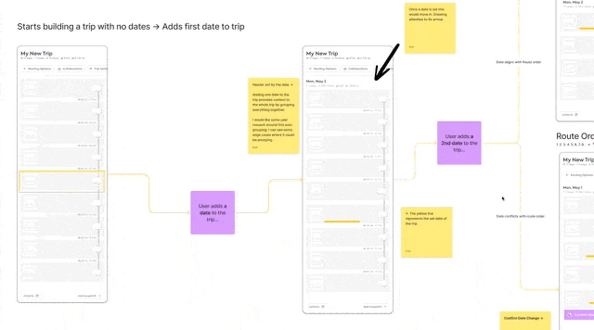
The planning phase involved extensive collaboration with stakeholders to map out user flows and identify modular components. Using FigJam as our virtual whiteboard, we conducted multiple workshops to break down complex trip planning scenarios into discrete, reusable patterns. This modular approach was crucial, as it allowed us to design components that could be recombined to support various use cases—from simple day trips to complex multi-week journeys. We focused particularly on how different UI elements would need to interact, considering states like expanded/collapsed views, drag-and-drop functionality, and how information density could be managed across different screen sizes. This groundwork was essential for ensuring our design could scale while maintaining consistency across platforms.
Solution
The solution was implemented through several key initiatives:
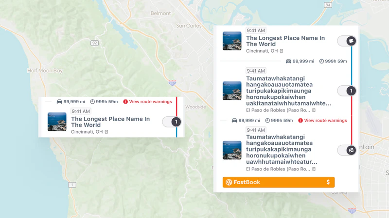
- Modular Trip Planner Development
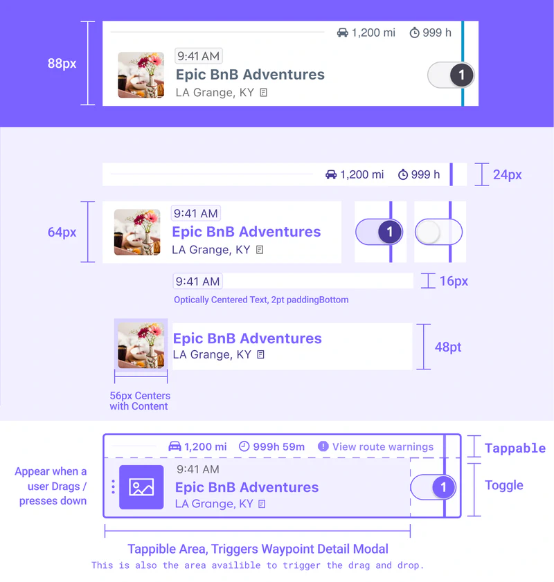
- Created hundreds of prototypes focusing on critical UI details
- Built interface to handle future features like daily trip segmentation
- Designed robust, modular components for easy developer implementation
- Color System Overhaul
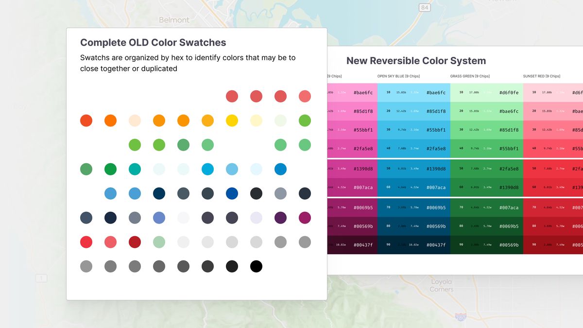
- Conducted comprehensive color audit across all platforms
- Developed five distinct color ladders meeting accessibility standards
- Ensured 4.5:1 contrast ratio between lightest and darkest tones
- Created semantic and intentional color system foundation for dark mode
- Cross-Platform Consistency
- Standardized UI components across iOS, Android, and Web
- Implemented consistent typography while maintaining platform-specific requirements
- Developed flexible baseline grid system for cross-platform compatibility
Impact
The redesign delivered significant improvements to the Roadtrippers platform:
Technical Achievements
- Successfully implemented an accessible color system meeting WCAG guidelines
- Created modular components that simplified feature integration
- Established cross-platform typography system maintaining baseline grid consistency
User Experience Improvements
- Enhanced trip planning flexibility for power users
- 20% increase in multi-leg trip planning
- 30% increase in the number of trips planned by power users
- Improved search and filter functionality
- Maintained platform consistency across all devices
Future-Proofing
- Set foundation for future dark mode implementation
- Established groundwork for the Bonfire Design System
- Created scalable architecture for future feature additions
The project successfully positioned Roadtrippers as a more reliable and intuitive “copilot” for travelers while establishing a strong foundation for future platform enhancements.
Project Gallery
